
Color of the Year 2024

Hello There Design Aficionados!
The weather has definitely turned—I’m proclaiming it Hygge season. Time to pull out my fur throws, candles, and turn on the lamps. Everything is getting comfy cozy and warming up.
In the world of design, the Color of the Year for the major paint companies is this time of year as well. It is a highly anticipated and influential announcement that sets the tone for creative industries, from fashion to interior decor, and even graphic design. It's a powerful indicator of the prevailing trends and a source of inspiration for artists and enthusiasts alike. As we prepare to step into the year 2024, the Color of the Year has once again taken center stage, igniting our curiosity and sparking our imaginations.
So, what exactly is the Color of the Year? What does it say about our collective aspirations and desires? Lets embark on a colorful adventure to unravel the mysteries and unveil the beauty of the Color of the Year 2024. Let's paint the future together!
Of course, Benjamin Moore COTY is THE one that I most look forward to. I wouldn’t be lying if I told you that it is written in my calendar with an alarm so I don’t miss the announcement. I get that excited. Like a little kid at Christmas.
Benjamin Moore Blue Nova
825 / CC860

Traditional style is trending. FINALLY. Benjamin Moore captured this by warming up blue. Blue Nova is a mid-tone that leans toward violet giving it a warmth that elevates this sumptuous hue while also has endlessly classic appeal.

Psychology of Color
Color creates specific moods and atmosphere to a home. Each hue is chosen carefully to set the particular mood that is desired.
Blue-Violet in color psychology creates the experience of calm, control, tranquility and intelligence.
It is perfectly suited for bathrooms, bedrooms, and shared living spaces, a blue-violet hue, such as Blue Nova, effortlessly infuses a sense of serenity wherever it graces. The richer tone exudes an air of understated strength.
Color Palette 2024
Yes, Benjamin Moore is just a bit extra. Not only do they have a COTY every year, but they also introduce a color palette to harmoniously collaborate with the main event.

Hands down, this is one of the best color palettes I’ve seen in quite a while. I hope you agree.
What inspires You?
Pro-Tip
“Inspiration for your space can come from many sources. It can come from a fabric that you couldn’t take your eyes off of, a classic painting, or a room you saw on the web”
And that is exactly where I began to search for inspiration for my Color Palette+ schemes. I have a few of my favorites to show you. I must say this is one of my favorite things to do once the color and palettes are unveiled.


I had fun. Are you inspired to create your own Color Palette+?
Ways to Use Color

Envelope the whole room with color—ceiling, walls and trim for a bold aesthetic., such as Topaz via BM

Paint your trim a dark tone (Regent Green) for a fantastic contrast to the warm white walls (White Dove) via BM
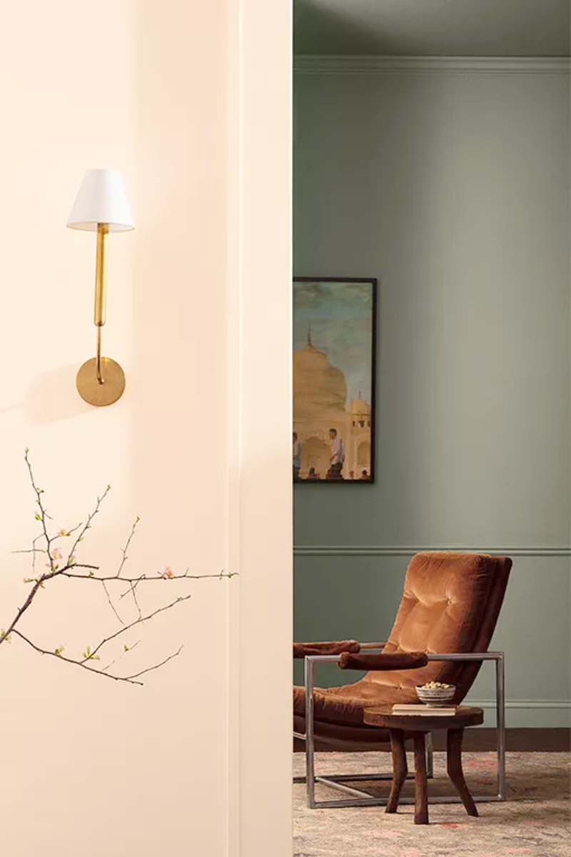
Create an air of mystery with a moodier hue (Antique Pewter) off of the main hallway (Pristine)

Draw the eye to this curved staircase, a special architectural feature (Topaz) in an otherwise neutral space (White Dove). via BM

Surround your self in a soft lilac haze that lulls you into dream land and gently wakes as the sun rises and shines softly. via BM
