
2025 Color Trends: Classic hues for Elegant Interiors

Hello there, Design Aficionado!
I hope you had a wonderful Thanksgiving. Time spent gathered around the table is always well spent. It’s been another crazy year, but we still have so much to be thankful for.
Mr Man and I are back from our vacation in Aruba. So many have teased us that Aruba is where Floridians go to vacation. I almost didn’t come back. It was heavenly. We snorkeled, dined on a sunset sailboat, and generally soaked in the sun and floated in the ocean. A dream vacation for sure. I have returned refreshed.
Why Pantone?
Funny you should ask. As I’m getting back to real life, Pantone FINALLY revealed their color of the year earlier this morning. I watch and listen to experts in the design industry for the pulse regarding color. Pantone is the leading color influencer in fashion, marketing, and my favorite interior design. Why? Because many years ago Pantone saw a need to portray color accurately across the board. Lawrence Herbert founded the Pantone Matching System (PMS). The communication of consistency throughout planning, production, and marketing is imperative.
Don’t Keep us Waiting!
Ok, Ok. For a few years, I have been hearing brown was going to be the next “it” color. I was not seeing that. We have had a definite warming trend but no browns. So I had predicted that a hot cocoa brown would emerge and this would be the year. I was slightly off. Instead of hot chocolate, they revealed MOCHA MOUSSE. I’ll take it!

Pantone describes Mocha Mousse as an evocative soft brown, a warming rich brown hue. Mr. Man might say its also a yummy treat! He does love his chocolate.
Color Psycology
I do love to get into the science of color.
Is color psychology really a thing, you ask. Yes, it is. It’s basically rooted in the way your brain, (and mine) processes the wavelength of light which perceives color stimulis.
Brown, an earthy hue has long held a sense of strength, reliability, and resilience. I’d say its a rather demure choice.
Now for the Art of it
How does it relate to Benjamin Moore, Fran?
Oh, you have been listening. I spend a good while translating Mocha Mousse into a a Benjamin Moore color. Because as you guessed, a Pantone color doesn’t do you, aficionado, any good if you can’t paint it. I’m here for you.
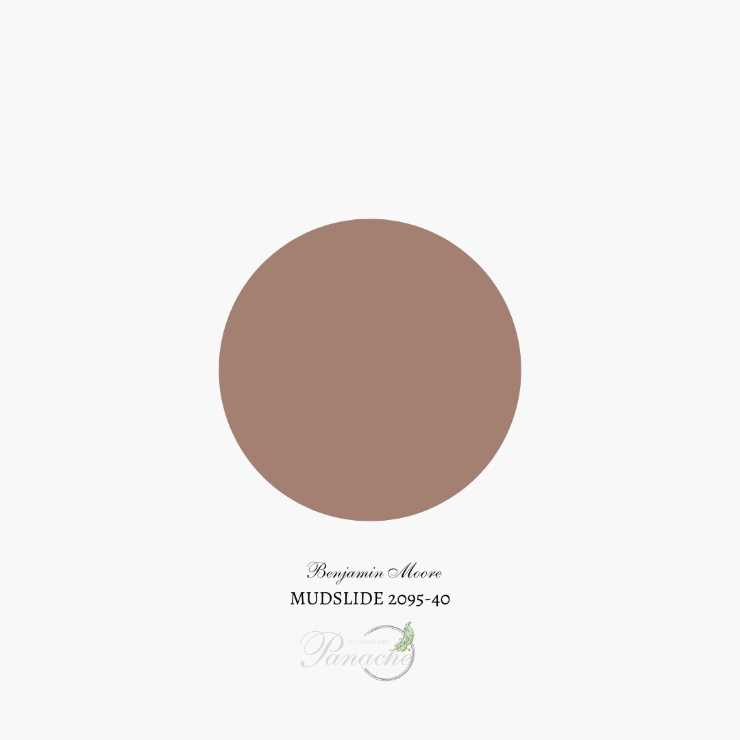
Benjamin Moore Mudslide 2095-40 is a neutral, mid-tone hue of an attractive tannish brown with a pink undertone according to their website.
What kind of color scheme would you create?
I believe I would lighten the scheme with Southern Comfort 2095-60 and Just Beige 2095-50 and let Mudslide be the accent for a harmonious Color Palette+. A soft feminine spin on this shade.

Pro-tip
The number one trend is to color drench. What is that? It is the technique of painting every surface in the room with a single color creating the panache effect. The walls, trim, built-ins, and ceiling are painted. No masking off needed here, unless the same color but higher sheen is used on the trim and built-ins. Is it timeless? I believe it can be. Especially if you do it sparingly and a saturated dark to mid-toned colors such as Mudslide. What does that mean? Choose one room. Use it in single separated rooms such as a mudroom, home office or bedroom, dining room or bathroom.
How will you use it?

Are you stuck in decision fatigue? I can help. Book a Discovery Call today!